gemma.
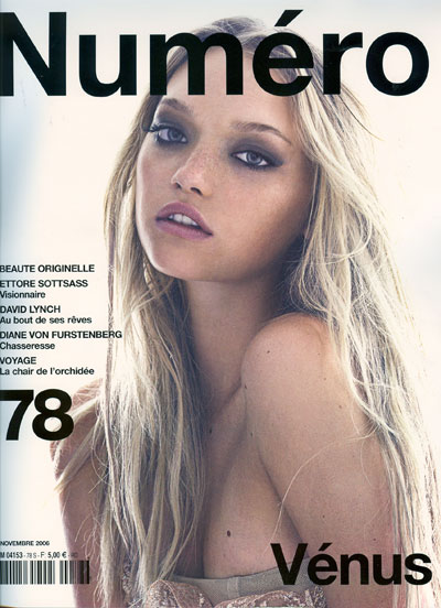
 i just really had to post this cover of Numero Nov06, because Gemma looks absolutely stunning. although this looks like a cover of a july issue more than a november, the combination of blue eyeshadow, pink lips and the beach blond hair is just so perfectly done.
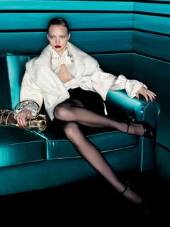
on the other hand, the valentino fw06 ads makes her look really bad in my opinion. i know there are a ton of other ads that are worse than this one, like the bottega veneta ones with iguna (yawwnnn), but for some reason, this ad really disappoints me.
 i just really had to post this cover of Numero Nov06, because Gemma looks absolutely stunning. although this looks like a cover of a july issue more than a november, the combination of blue eyeshadow, pink lips and the beach blond hair is just so perfectly done.


1 Comments:
gemma looks so much more natural and at ease on the cover. the valentino ads make her look like a little girl swiping on her mother's red lipstick and clothing. not good.
Post a Comment
<< Home