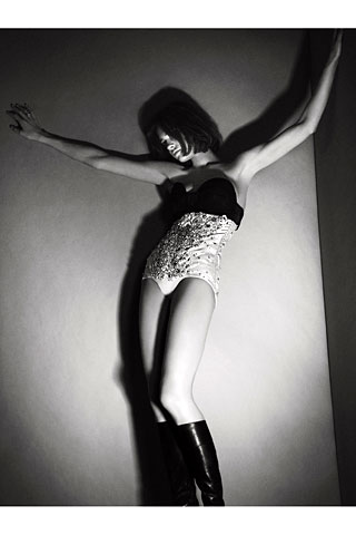
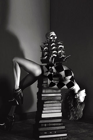
In my opinion, the cover is quite good. Natalia looks hauntingly beautiful with red hair and thoes blue eyes of hers. The colors in this photo are all so neutral&simple, but you notice every detail.


Call of the Wind. Photogrphed by Mert Alas and Marcus Piggott
Thoes are some very well done black and whites. The positioning on the second one is so unique. Natalia must have some skills to hold still like that.


1 Comments:
love the cover ,,natalia's hair looks really gorgeous.. but So many mags with balenciaga!!
Post a Comment
<< Home